French Vocabulary App
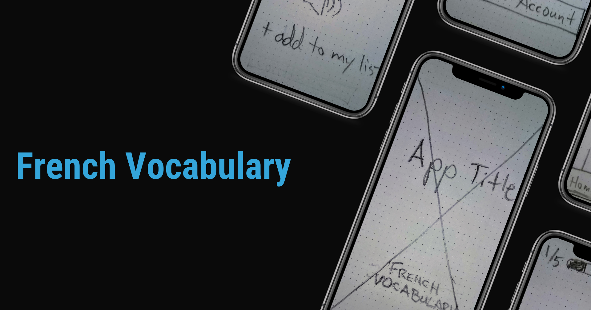
In the first part of my UX Design Studies at CareerFoundry, the goal was to work through the initial design phases in the creation of a vocabulary app, in just one month.
The target user could be chosen by me, but one of the main parameters was that it needed to be used “on the go”, with exercises kept to 5-10 minute blocks.
Follow the design process below.

Client
CareerFoundry
Role
UX Designer
Tasks
Concept Creation
Research
Wireframing
Prototyping
Objective
To create a mobile application focused on learning new French vocabulary.
Challenge
Learning a foreign language can be difficult. Users need a way to quickly improve their vocabulary in a foreign language, in this case: French. The challenge was to understand what users need, through competitive analysis, user interviews and initial prototype testing.
THE PROCESS
To get to the current result, the following design process was followed.
01
Understand
Competitor Analysis
02
Observe
User Interviews
03
Point of View
User Persona
Task Analysis
User Flows
04
Prototyping
Low Fidelity Wireframes
05
Testing
Usability Testing
01 UNDERSTAND
Competitor Analysis
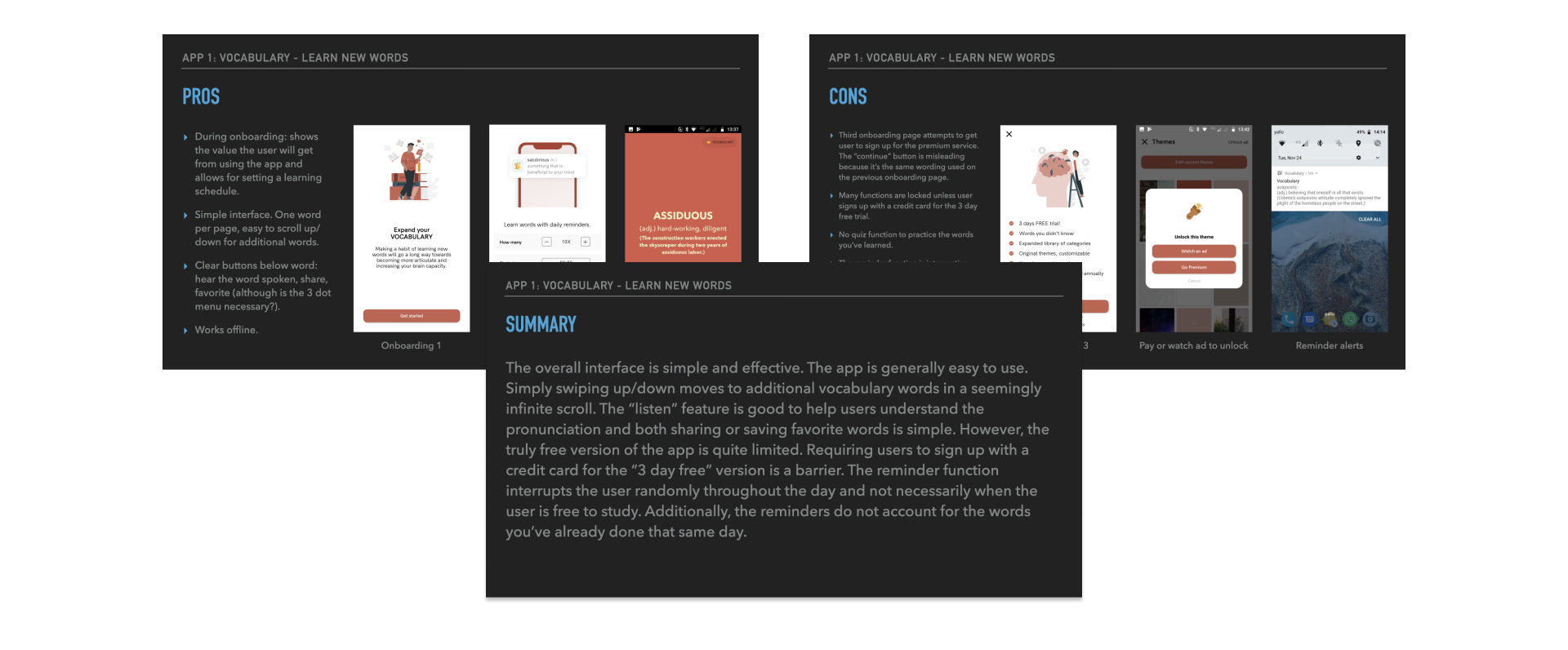
In order to understand the current climate of vocabulary apps, I researched three different competitors.
- Vocabulary Builder
- Vocabulary – Learn New Words
- Word of the Day


Each application claimed to assist its users with learning new words and increasing one’s vocabulary. My competitor analysis considered how the users’ experience with each app affects those results.
02 OBSERVE
User Interviews
Overview
After understanding what some other competitor apps offered, I wanted to get a sense of how real users interacted with vocabulary apps when learning a foreign language. I conducted interviews to determine the following:
Key Goals
- Understand reasons for learning the foreign language.
- What are the biggest challenges to learning a foreign language?
- Determine user pain points when using existing apps.
- Understanding what features are most helpful to users within an app.
- What are users’ time constraints / availability for learning a new language?
Insights
- There is an excitement to learning a new language. The ability to communicate with others is pleasing.
- For truly in-depth learning of a new language, in-person learning is preferred over an app.
- Convenience is the main reason for choosing an app or online course. In person learning takes time and learning grammar or vocabulary can be done well within an app.
- Lack of time: it’s difficult to fit language study into one’s daily schedule.
03 POINT OF VIEW
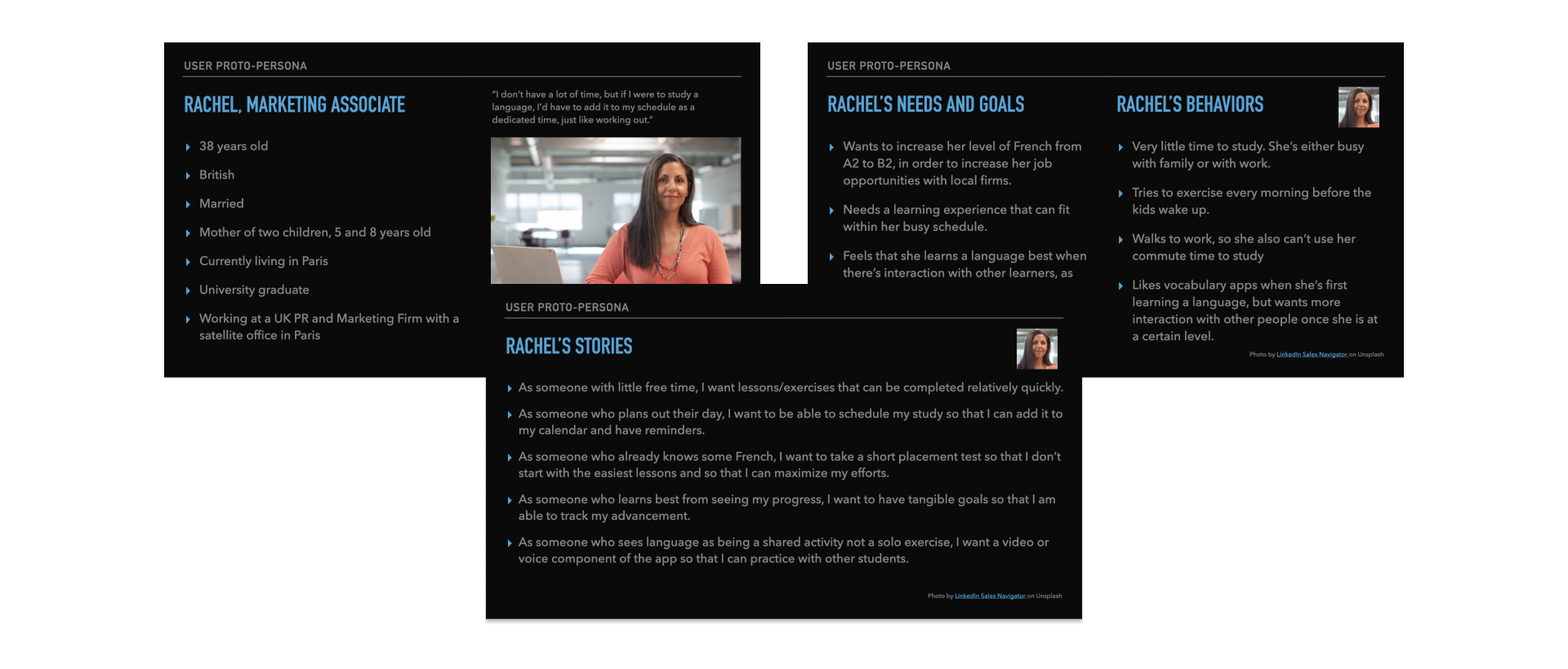
User Persona: Rachel
Marketing Associate / Mom of two children

“I don’t have a lot of time, but if I were to study a language, I’d have to add it to my schedule as a dedicated time, just like working out.”
Task Analysis and User Flows
Click on image for PDF file of the task analysis.
04 PROTOTYPING
Low Fidelity Prototyping
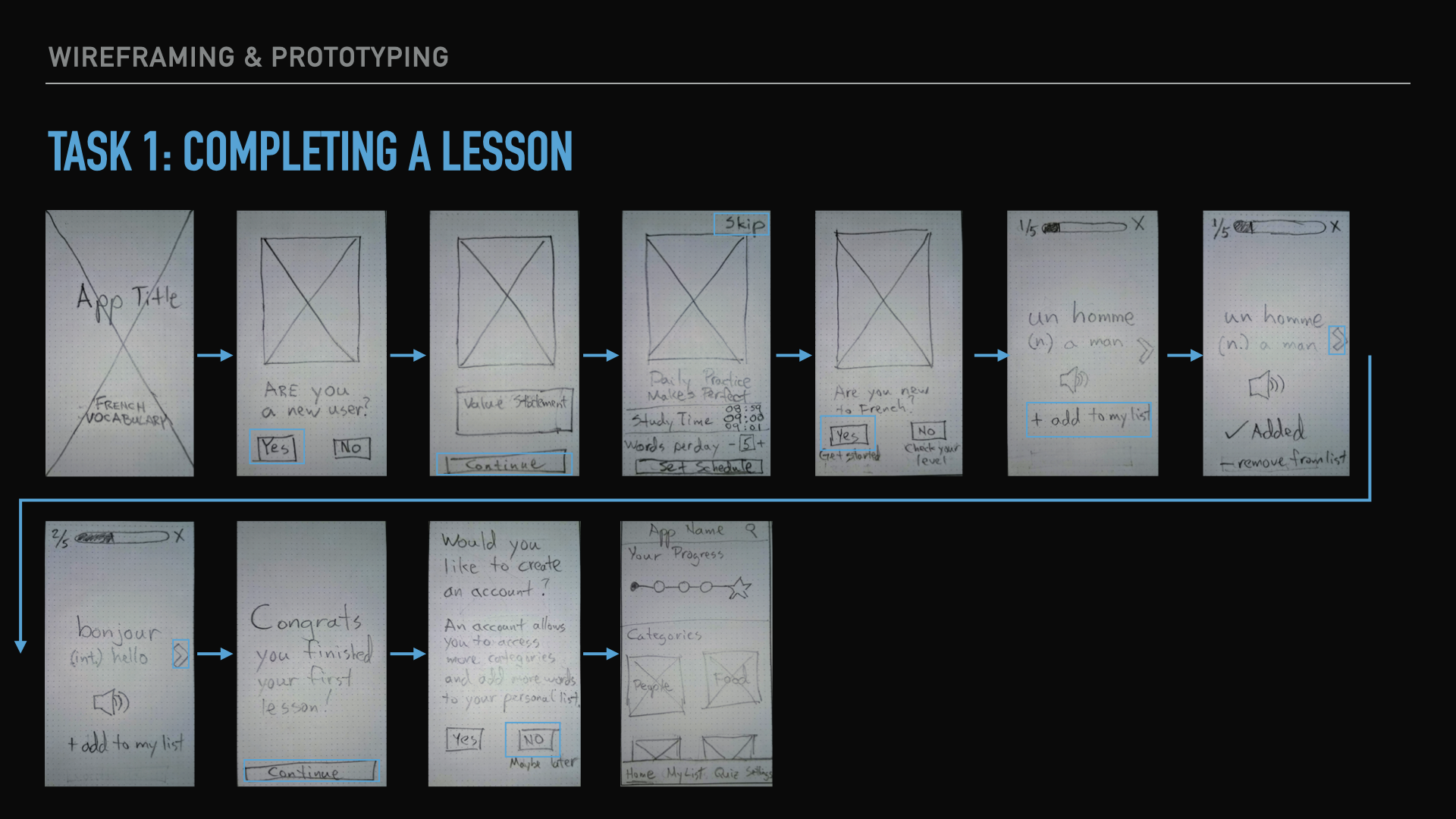
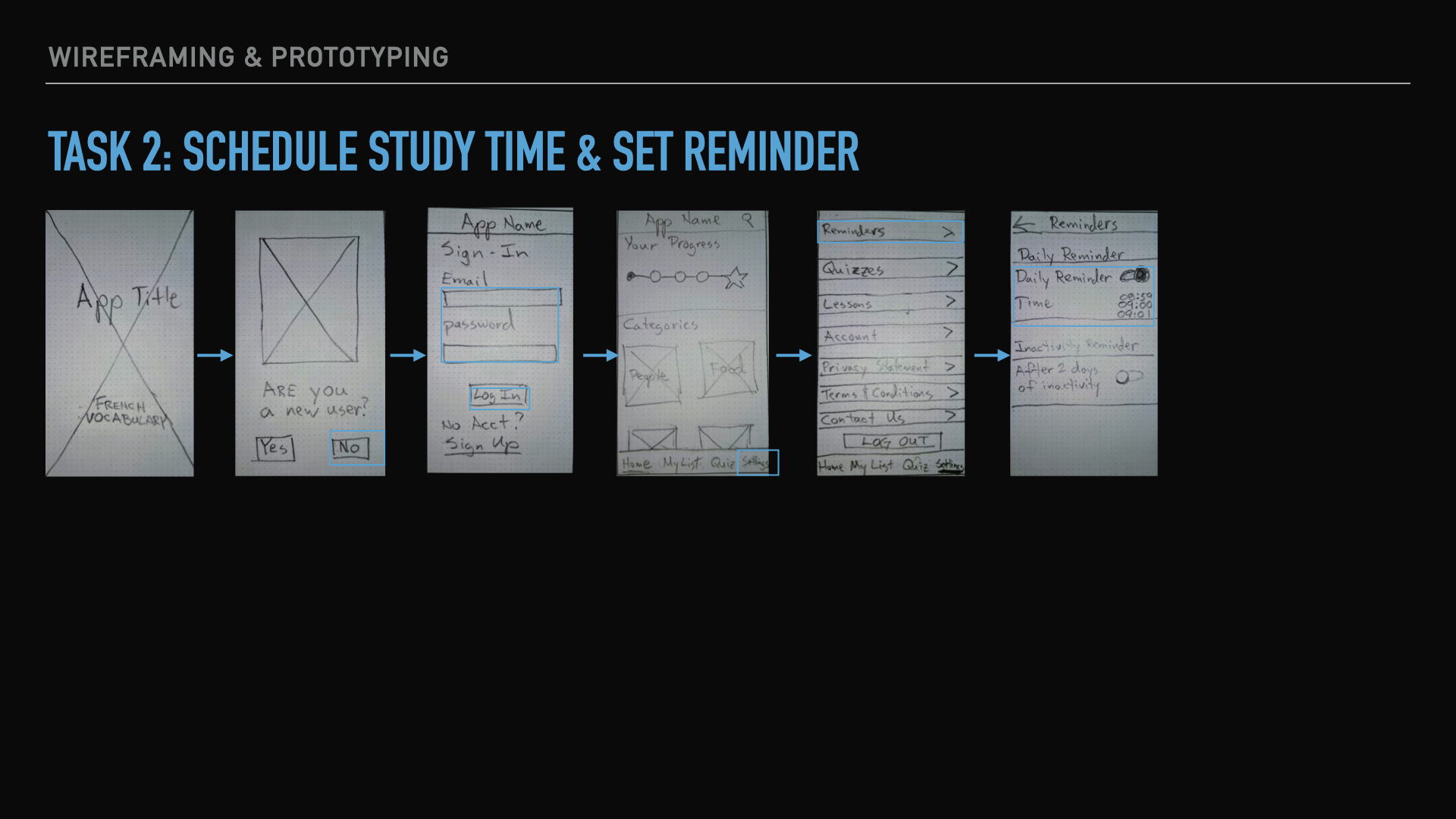
Once I began to have a sense of the initial user flows, I quickly sketched out some wireframes to reflect the same two user tasks outlined above.
05 TESTING
At this stage in the process, I wanted to get feedback on the wireframes and flows.
Usability Testing
I conducted usability tests with 3 participants. The tests were moderated by myself and conducted remotely.
Tools
- Zoom for meetings, recordings, and screen sharing.
- The prototype was created in Marvel and a link was shared with the participants to be viewed in their web browsers.
- Consent forms were PDF format and viewed and signed digitally.
There were little to no technical issues while conducting the tests.
Key Takeaways
The prototype was obviously in a low-fidelity state, but even so users generally found it easy to understand. There were several suggestions that arose that should be considered for future iterations:
-
It’s worth considering altering the welcome / onboarding pages slightly.
-
All users were able to log-in as an existing user, however adding a “stay signed in” checkbox might be helpful.
-
As app continues through prototyping iterations, explore option of adding a “add word” to the home screen.
-
For the “set study reminder”, simplicity is important here. Keep the reminder toggle. Make clock the scroll up/down variety.
Revisions
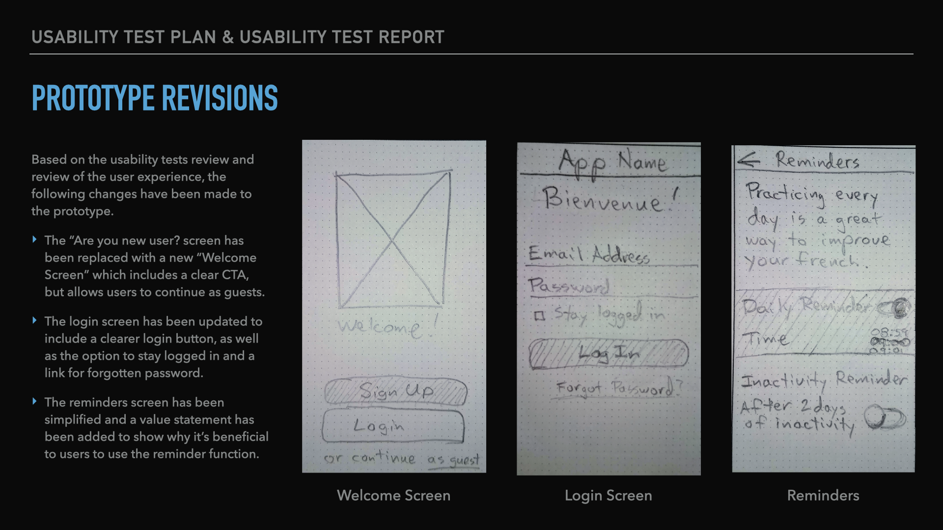
Based on the usability tests review and review of the user experience, the following changes have been made to the prototype:
- The “Are you new user? screen has been replaced with a new “Welcome Screen” which includes a clear CTA, but allows users to continue as guests.
- The login screen has been updated to include a clearer login button, as well as the option to stay logged in and a link for forgotten password.
- The reminders screen has been simplified and a value statement has been added to show why it’s beneficial to users to use the reminder function.
Current Design and Next Steps
Current Design
Naturally, these are just the first steps in a more extensive process to create a vocabulary app, nevertheless it is a solid start to understanding users’ needs.
Next Steps
- create mid-fidelity and high-fidelity prototypes
- continued usability testing with a larger group of users
- conduct preference testing and user surveys
- create a sitemap
Knowledge Gained
As this was my first UX project, obviously I learned quite a lot about the design process. Most specifically, I learned:
- the importance of research before designing
- let users talk freely during interviews and allow natural conversations to happen
- do sufficient user interviews and usability tests
- test and retest prototypes
Summary
I created this brief video summary of the project, to walk you through the project and its findings.
