FITTED: A Responsive Fitness App
In an intensive, two month project at Career Foundry I created the UI for a responsive web app entitled Fitted.
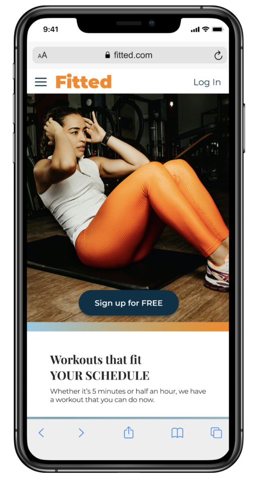
The goal of the app is to encourage and motivate “new to fitness” users into improving their lives through daily exercise in as little as 5 to 10 minutes. The workouts should be able to be done at any time, anywhere, to fit in with the users’ schedules.
The final design considered the needs of the primary persona as well as the business needs and branding guidelines.
Follow the design process below.
Client
CareerFoundry
Role
UX / UI Designer
Tasks
User Flow Diagrams
Mood Boards
Wireframing
Responsive Layouts & Grids
Prototyping
Icon Creation
Style Guide
Objective
To motivate people new to fitness, to follow an exercise routine that suites their level, schedule and interests.
Challenge
Finding exercise routines that match your level can be difficult, especially if you’re new to working out. This app aims be appealing for beginners to help them establish good habits while fitting into their existing schedules. This means finding workouts that can be done in as little as five minutes.
THE PROCESS
To get to the current result, the following design process was followed.
01
Understand
User Persona
User Flows
User Stories
Initial Sketches / Wireframes
02
Lay The Foundation
Responsive Grid / Layout
Mood Boards
Color Palette
Typography
03
Visual Development
Imagery
Icons
Gestures / Animations
04
Design Iteration
Responsive Design Breakpoints
Style Guide
Mockups
01 UNDERSTAND
User Persona: Rebecca
Software Developer / Mom of 3 year old
“I love the thought of having something that could really work with my schedule. Being as busy as I am makes it tough to exercise otherwise.”
Goals
- Rebecca wants to lose weight and get in shape, as her sedentary job doesn’t allow a lot of time for exercising.
- To help with this goal, Rebecca wants to find a tool that will help her fit exercise routines into her busy schedule.
- Rebecca wants help finding routines she can enjoy.
Tasks
- Rebecca wants to be able to find exercises that match her goals of losing weight and getting in shape.
In addition, she wants to find short exercises that she can do multiple times per day in between other activities. - She wants the tool to keep her motivated as well, as her schedule can often be distracting
Environment
- Physical: Rebecca lives in an apartment with her boyfriend and 3-year old daughter.
- Social: She has several friends from her software development job, and one of them
recommended this tool as something she should check out to help her reach her
goals. - Technological: Rebecca is very tech savvy, as she works on computers every day.
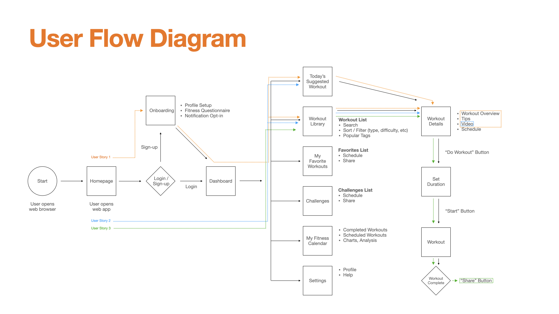
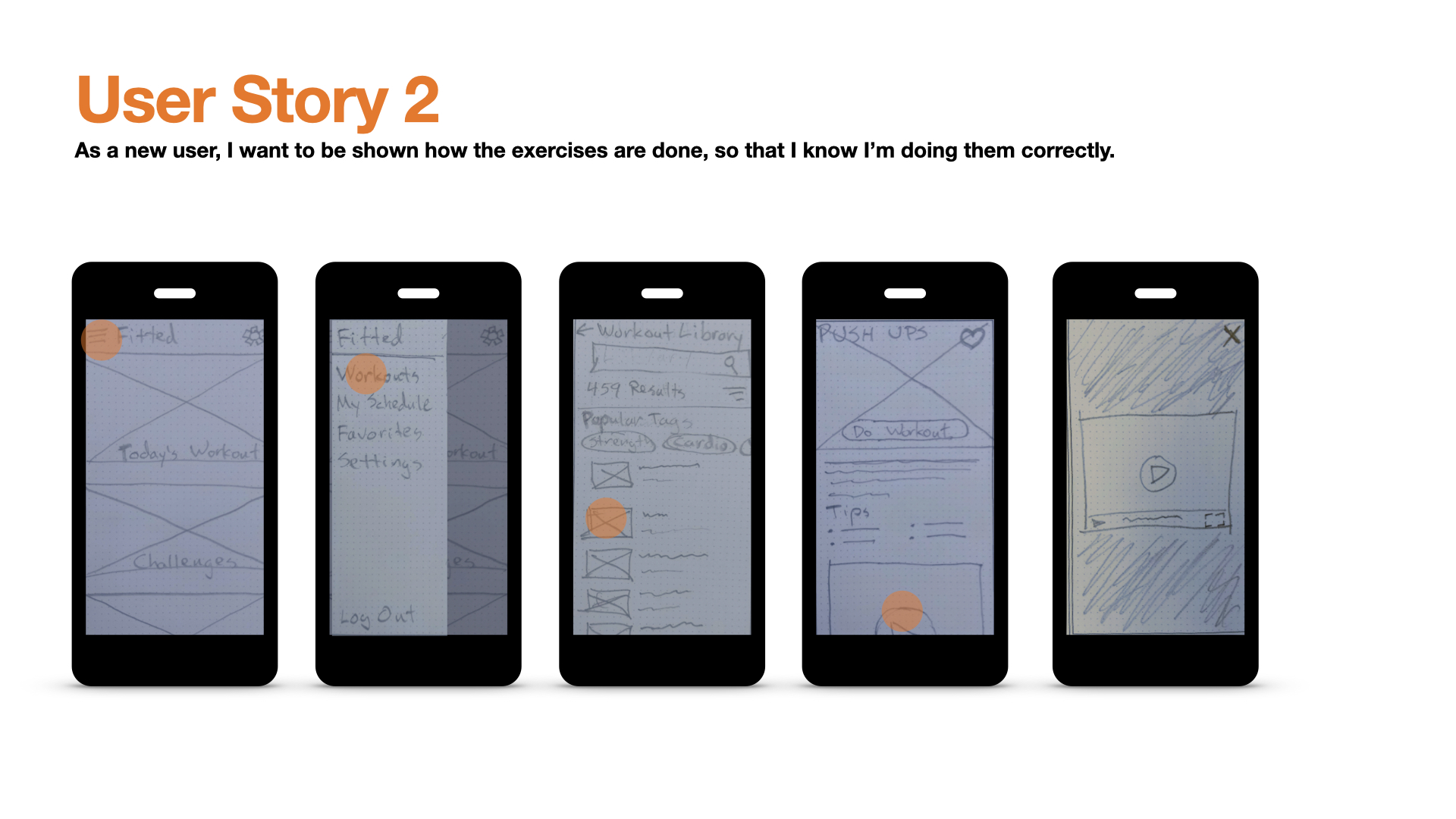
User Flows and User Stories
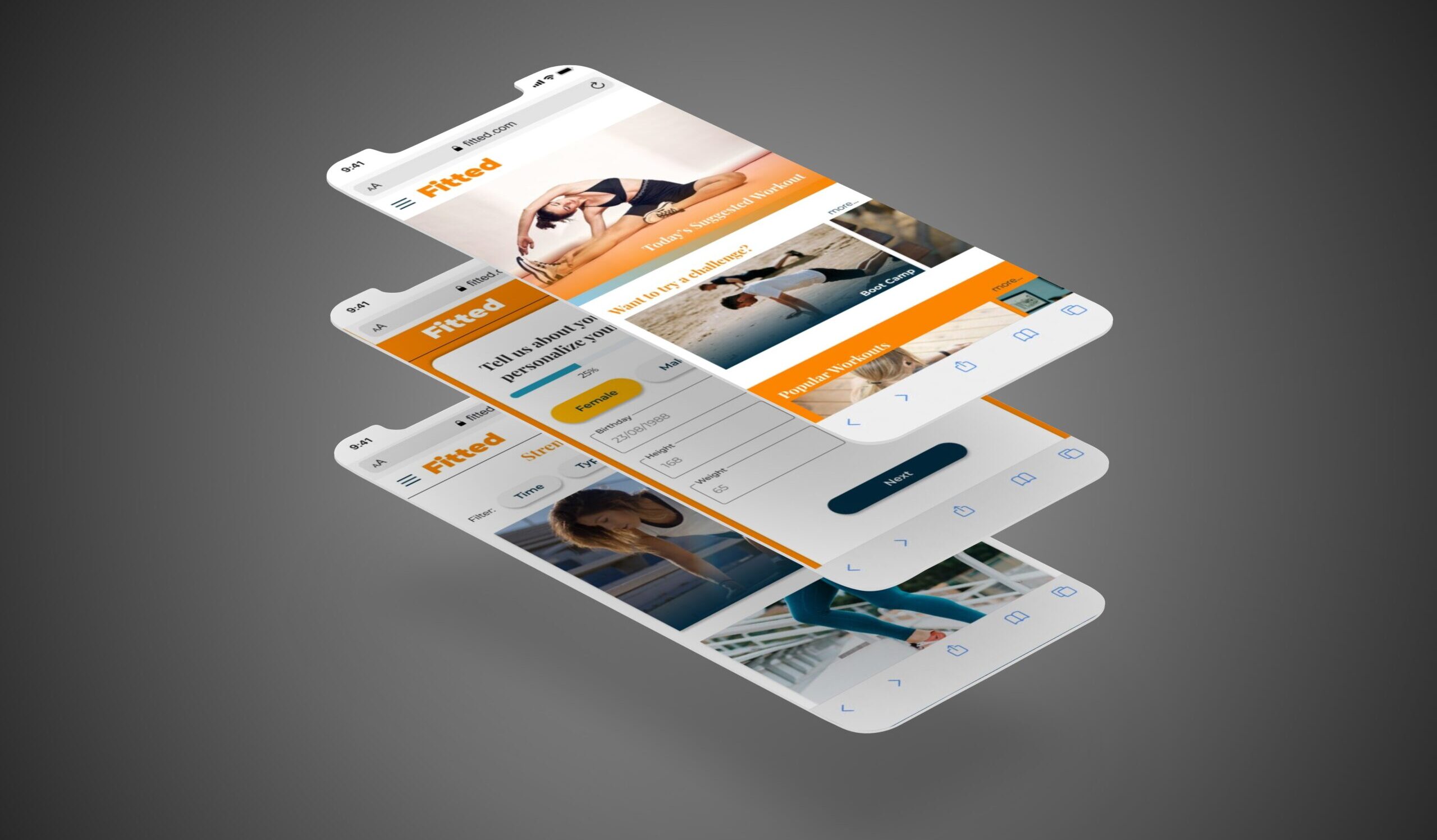
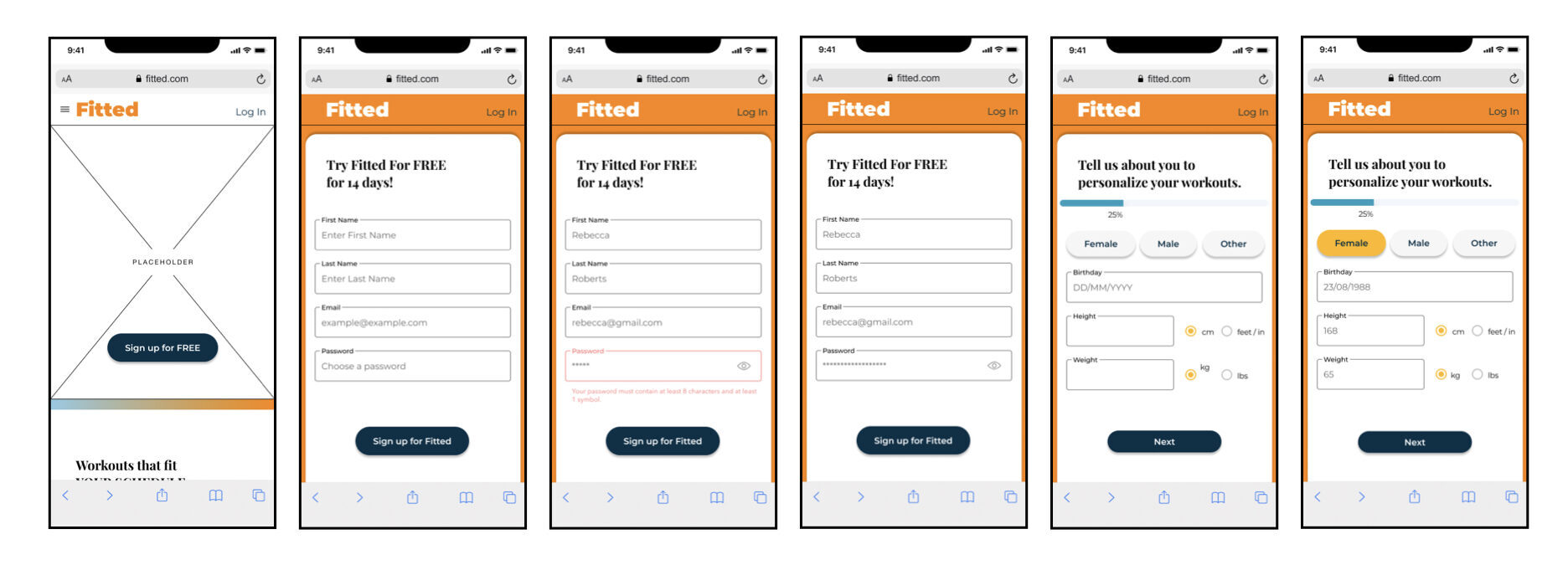
Using three of the main user stories, I created a user flow diagram to illustrate the path each user would take within the app to complete their goal.
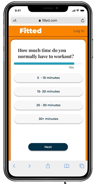
This exercise helped map out the initial screens in the low-fidelity wireframes. An example of the wireframes can be seen below. Click here if you’d like to download a pdf of all three user stories and the user flow diagram.
02 LAY THE FOUNDATION
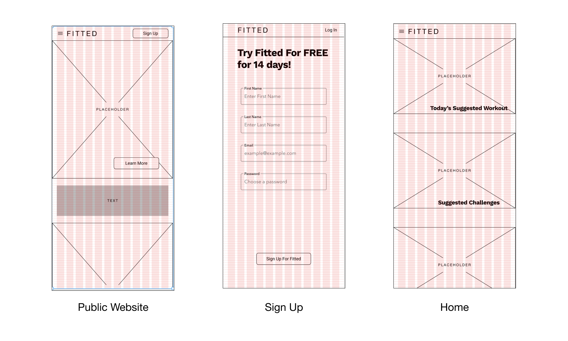
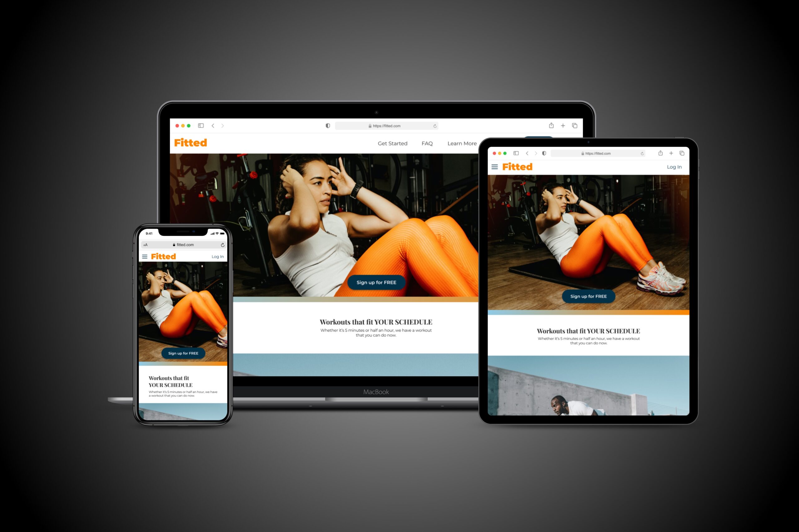
Responsive Grid and Layout
Using a mobile first approach to design, I further refined my wireframes for the Fitted app, applying a layout grid to all user flows in the previous iteration. I used the Bootstrap framework as a guide. I also set up rows 8 px apart to ensure proper component placement and sizing within the layout.
Columns: 12
Gutter Width: 8 px
Margin Width: 16 px
Mood Boards
Target Audience
In light of the fact that the Fitted app is targeted to people that are new to fitness or returning to fitness after a long hiatus, I believe that a brighter, more playful mood board is the most appropriate choice.
There are many other apps and fitness products that seem to use a more subdued, refined palette, but I think it makes them a little less accessible to the “new to fitness” user.
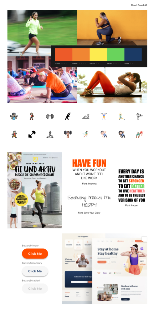
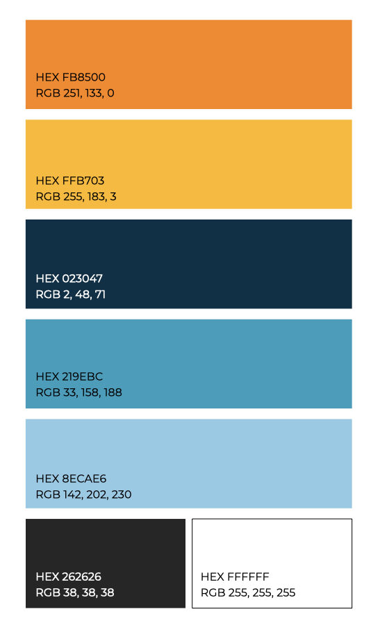
Color Palette Process
- I considered three different potential color palettes, all of which came from the base color orange, as outlined in the project brief as the brand color.
- I wanted to create a light, enjoyable and fun palette to instill excitement in our users to use Fitted and to exercise.
- I took various different approaches to choosing potential palettes: complementary colors, analogous colors, and online palette generators.
- Ultimately, I liked the idea of using a range of complementary oranges and blues for a more impactful, yet still playful palette. I decided to use this color palette, primarily for the orange/gold hues with blue as accent colors. I’ll also use a dark grey and white for text.
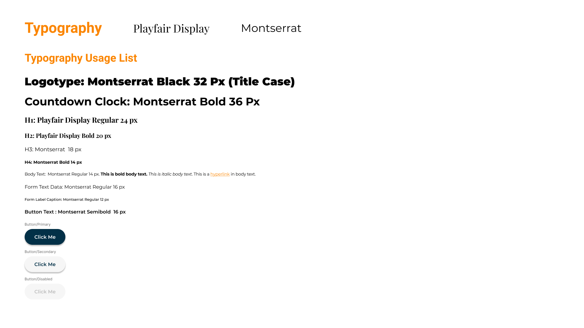
Typography
Overview
To combine an approachable yet professional image, I chose to use two typefaces: Playfair Display and Monserrat.
Mid-fidelity Wireframes
With decisions made regarding color palette and typography, I continued to revise my mid-fidelity wireframes.
03 VISUAL DEVELOPMENT
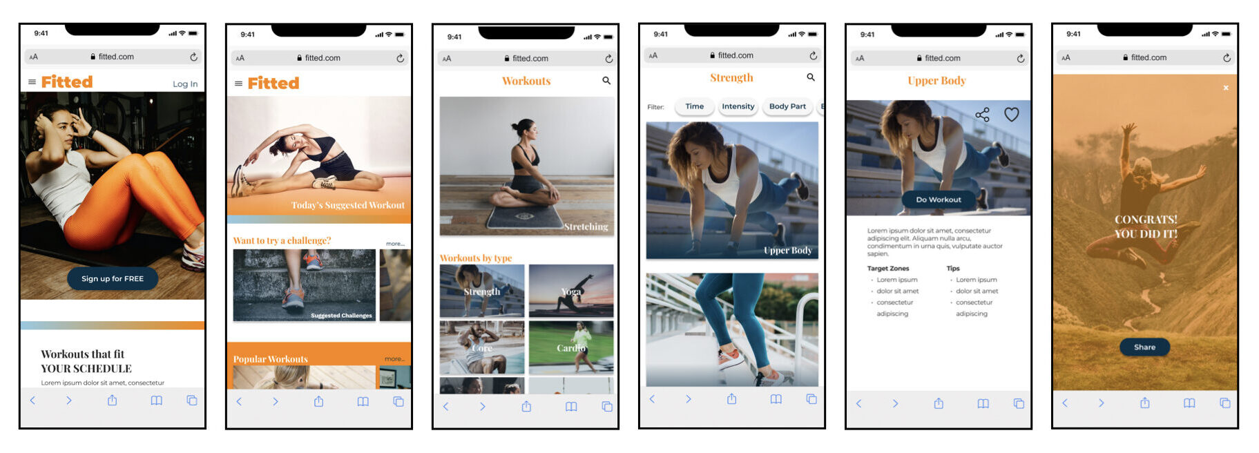
Imagery
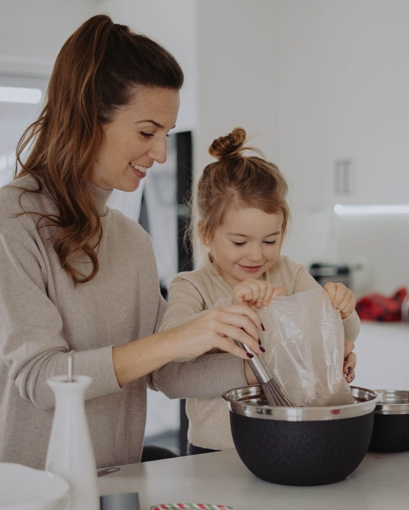
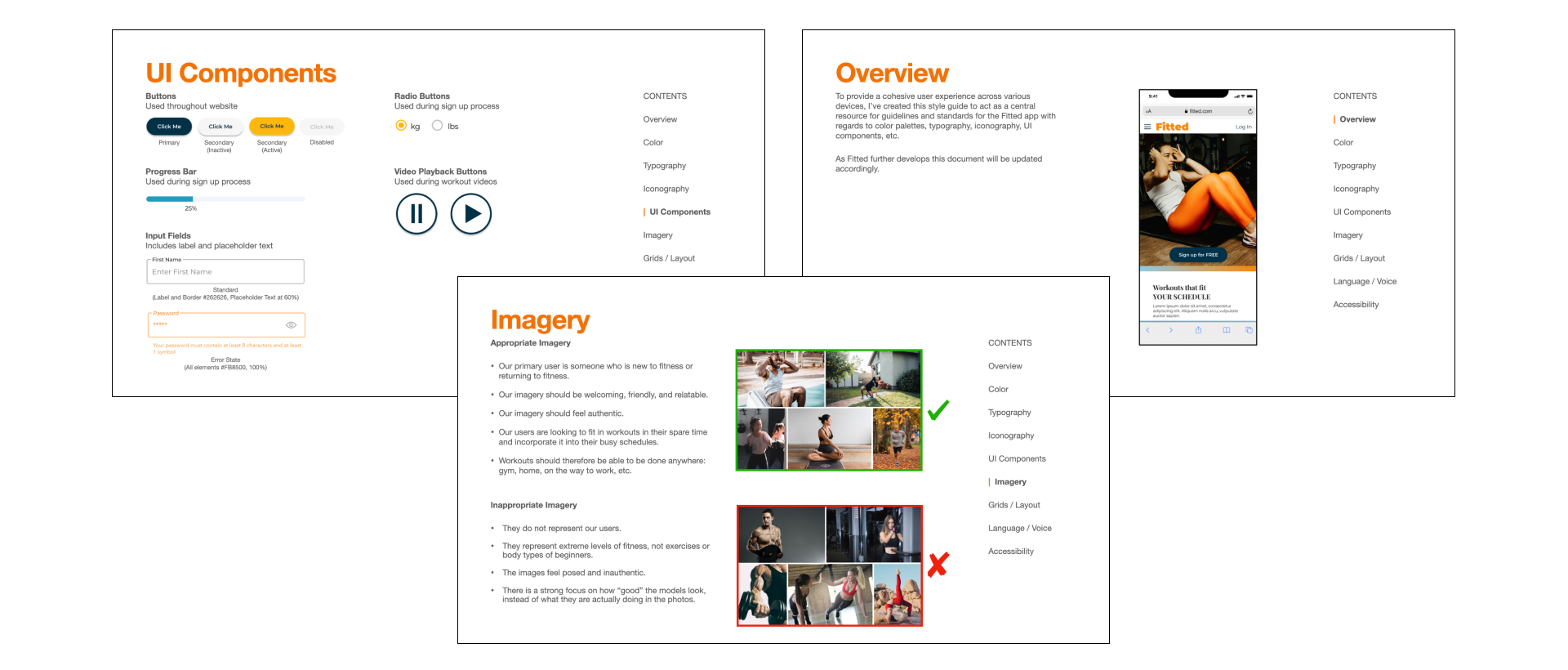
Staying true to the brand identity, I wanted to use appropriate images within the app:
- Our primary user is someone who is new to fitness or returning to fitness.
- Our imagery should be welcoming, friendly, and relatable.
- Our imagery should feel authentic.
- Our users are looking to fit in workouts in their spare time and incorporate it into their busy schedules.
- Workouts should therefore be able to be done anywhere: gym, home, on the way to work, etc.
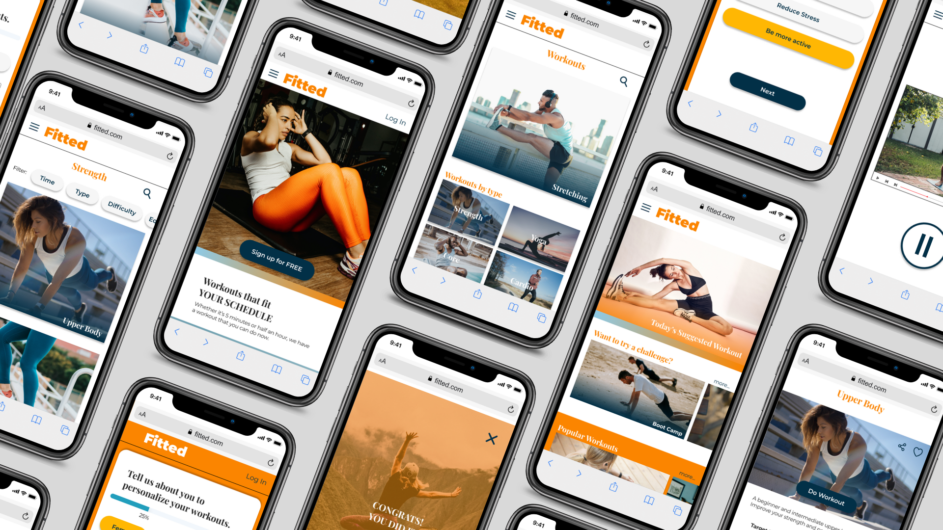
Example wireframes:
Icons
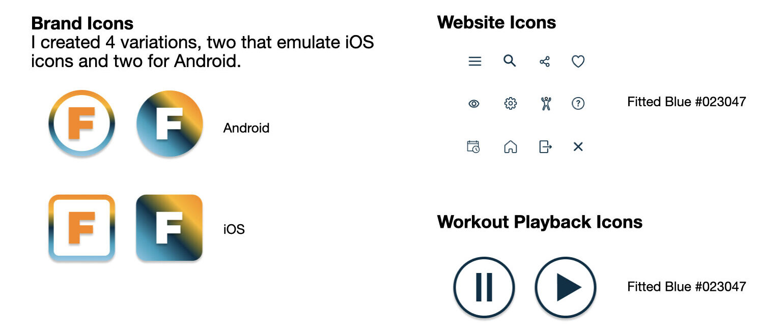
Animations and Gestures
As part of the prototype development, I added scroll and swipe gestures to the clickable prototype in Figma.
I also used this opportunity to create an example animation to conceal loading once a user had signed up to use the Fitted app.
04 DESIGN ITERATION
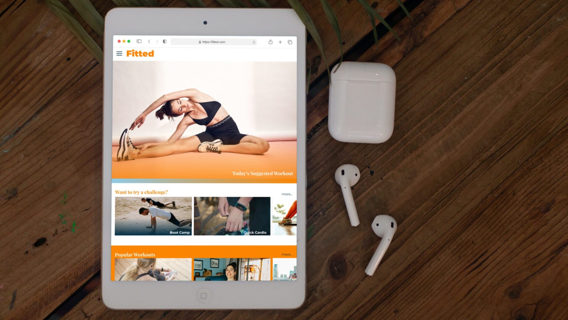
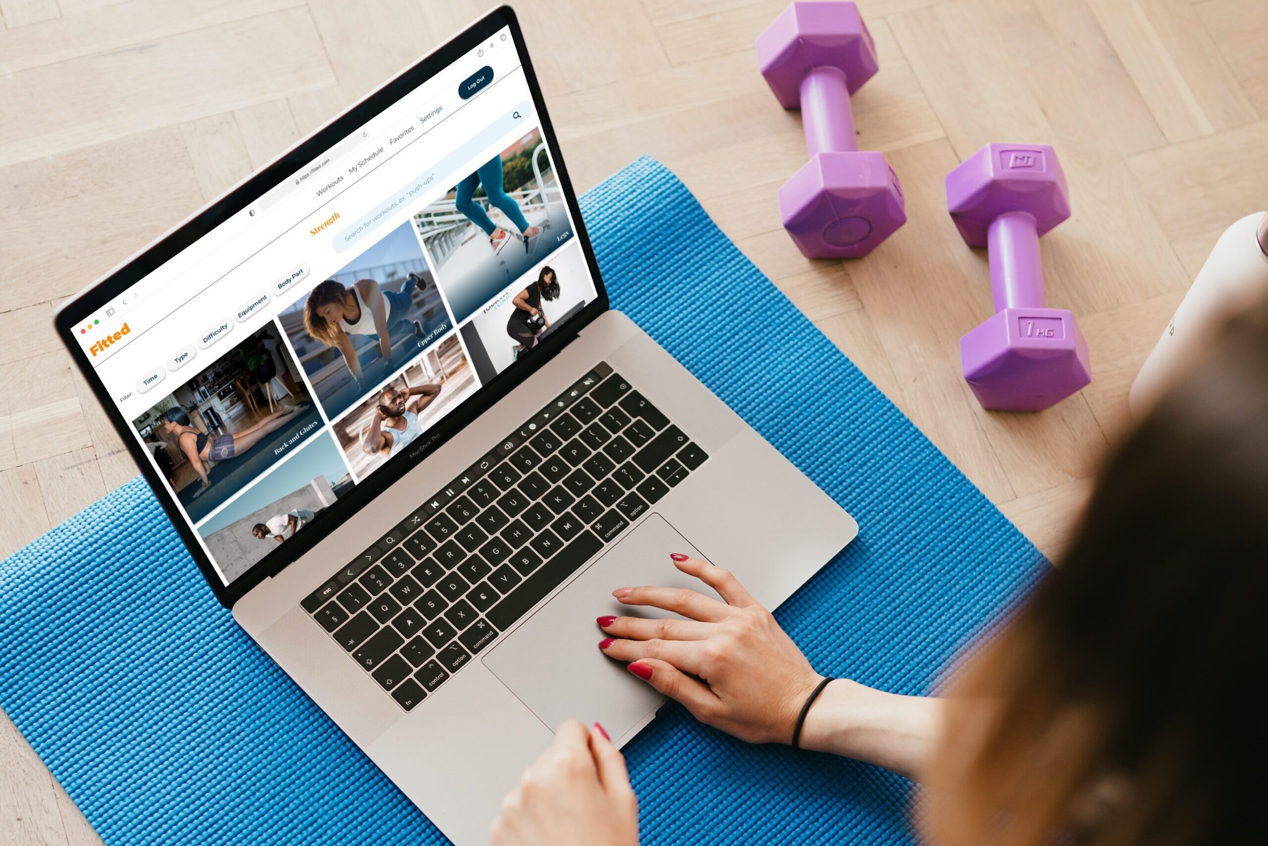
Responsive Design Breakpoints
After finalizing my mobile designs, I then created breakpoints for tablets and desktops, using Bootstrap resolutions of 768 px (small / tablet) and 1440 px (medium / desktop).
Style Guide
Overview
To provide a cohesive user experience across various devices, I’ve created this style guide to act as a central resource for guidelines and standards for the Fitted app with regards to color palettes, typography, iconography, UI components, etc.
Current Design and Next Steps
Current Design
The current design is a work in progress. Great strides have been taken in the two months that led up to the present iteration of the responsive app which include:
- a simple, clean design
- a mobile first, responsive layout
- a creation of a style guide for future iterations
Next Steps
- As a UX Designer, I would like to see a complete round of usability testing conducted. I think that the app visually is appealing and in general meets the users’ needs, however in order to verify it I would like to put it in front of a sizable group to further test its functionality.
- I would also like to continue building the tablet and mobile versions and continue to test those designs.