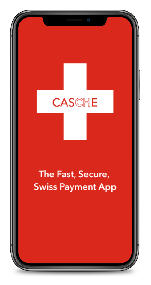
CASCHE: The Swiss Cashless Payment App
As part of my UX Design Studies at CareerFoundry, I was tasked with creating a responsive web app for cashless payments.
With the initial project idea starting from my own personal experiences dealing with payments as a Swiss resident, I discovered that a real problem existed and that there was no current solution on the market.
I therefore created a working hypothesis which I proceeded to expand on through competitive analysis and user research. My findings led to the development of user personas, task flows, wireframes, and ultimately a high-fidelity, clickable prototype which provides a solution to user needs.
Follow the design process below.
Client
CareerFoundry
Role
UX / UI Designer
Tasks
Concept Creation
Research
Wireframing
Prototyping
Visual Design
Objective
To allow users in Switzerland to shop in-store & online, and to transfer money, both domestically and internationally without excessive fees.
Challenge
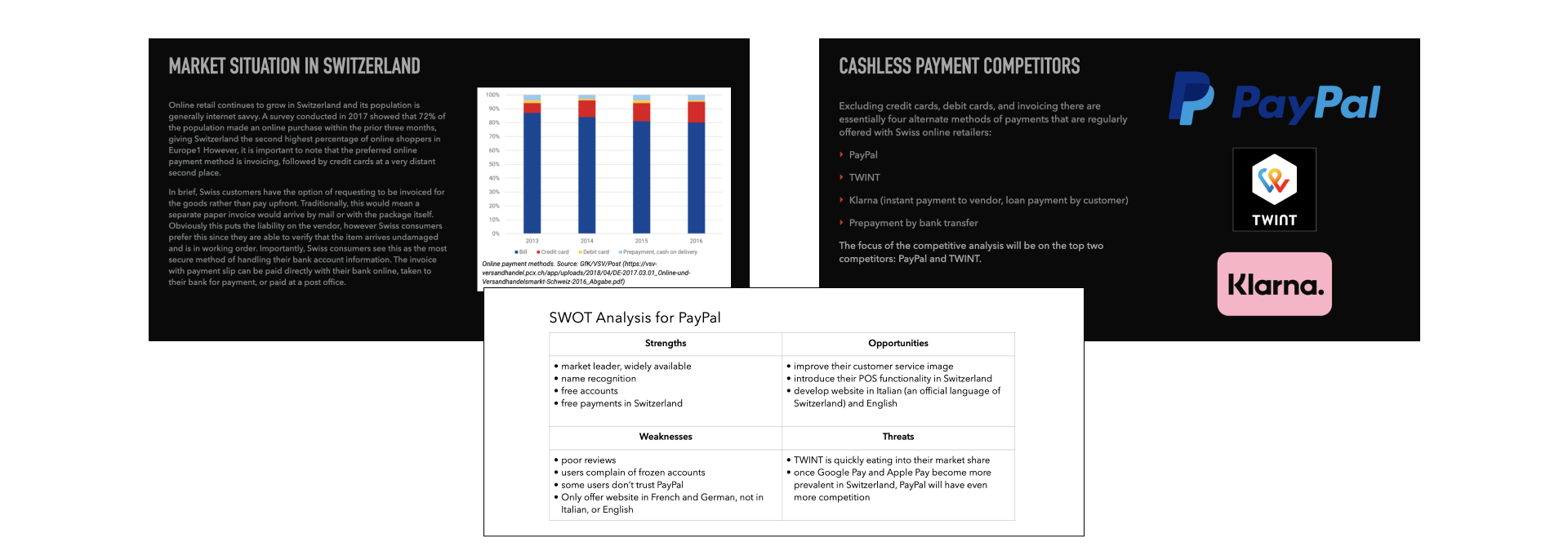
Currently users in Switzerland lack a unified payment app for their daily needs. The main competitor, TWINT, is perhaps the most well known, but it lacks key features (e.g. foreign payments, offline access, vendor acceptance). Bigger players, such as Google Pay and Apple Pay have yet to make substantial inroads into the Swiss market.
The CASCHE payment app seeks to meet user demands, by improving in the areas that competitors are lacking.
THE PROCESS
To get to the current result, the following design process was followed.
01
Understand
Competitor Analysis
Business Needs
Functional Requirements
02
Observe
User Surveys
User Interviews
Analyze Results
03
Point of View
User Personas
User Journeys
Task Analysis
User Flows
04
Ideate
Card Sorting
Sitemaps
Sketching
05
Prototyping
Low-Fidelity Prototype
Mid-Fidelity Prototype
06
Testing
Usability Testing
Preference Testing
07
Design Iteration
Design Language
Current Design
01 UNDERSTAND
Background and Competitor Analysis
To help me determine if my initial hypothesis was valid, I first decided to look into the market situation for payment apps in Switzerland. I then followed up with conducting a competitor analysis of the principle players in the country. From the competitors, I chose two (PayPal and TWINT) to do a deeper dive into their offerings. I conducted a SWOT analysis of each. Additionally, I created a detailed UX Analysis for TWINT’s online shopping experience.
Business Needs
Target Audience
Casche is targeted at Swiss residents between the age of 18 and 50 years old. While users older than 50 may also be a potential market, there is a greater probability that younger users would adopt a digital wallet payment method in lieu of traditional methods.
Casche is geared toward online shoppers (both on a computer or a mobile device) that want to speed up their checkout process; users that are tired from having to enter in credit card or other payment data every time, but also do not want to save their information with the seller.
Risk / Opportunity
The greatest risk for Casche is being able to break into the market. A majority of Swiss consumers still prefer being invoiced for goods rather than use a third party payment method. This is changing as more consumers use credit cards to pay. While PayPal and TWINT are the most available third party cashless payment options, their use is still minimal compared to invoicing and credit cards.
Furthermore, once Google Pay and Apple Pay fully enter the Swiss market it will be even more difficult to gain a market share.
An opportunity however exists. Swiss consumers are wary of giving their data to third parties and non-Swiss companies. Both issues can be addressed by creating Casche as native Swiss app with an emphasis that user data is handled in accordance to Swiss laws and stored securely on Swiss servers. Marketing will play a major role is this effort.
Conclusions
There is definitely room for a simpler and more varied online payment method for Swiss users. TWINT, while simple to use limits users to paying with only one account (e.g. bank account) and cannot be used for purchases outside of Switzerland. PayPal while a global brand that offers multiple payment sources, suffers from poor user reviews and overall distrust issues. The market is therefore open for Casche to improve in both of those areas.
Functional Requirements
- Login / Signup
- Onboarding / Feature Education
- Entering/Saving financial payment data
- Enabling Security Features (2FA, Backup codes, etc.)
- Peer to peer payments
- Contact List
- User Settings
- Customer Service Contact
- FAQs / Help
02 OBSERVE
User Surveys
Overview
I conducted a survey of Swiss participants with a focus on:
- Do they currently use a cashless payment app? Which one(s)? Reasons for choice?
- What is their preferred payment method online? Reasons for choice?
- What is their preferred payment method in a store? Reasons for choice?
- What type of device(s) do they typically use to shop online?
Key Findings
- 90% of Swiss respondents currently use one or more cashless payment apps.
- 88% use TWINT.
- 44% use PayPal.
- Apple Pay, Google Pay, and others were seldom used.
- The leading reason for using an app was to pay friends and family.
- The number one choice for paying online was TWINT (46% of Swiss respondents).
User Interviews
Overview
With the survey confirming my suspicions that there was a need for a better or new payment solution for Swiss users, I continued with my research by conducting a series of interviews.
Key Goals
- Understand reasons for preferred payment methods.
- Determine user pain points when using existing cashless apps.
- Understanding what features are most helpful to users when paying with an app.
- What do users enjoy and dislike about their current online and in store shopping experiences.
Insights
- One App For Everything Is Preferred.
Currently, most users have multiple payments solutions depending on the situation. Users expressed a desire to have one app meet all of their needs
- TWINT is well liked, but it has a limited set of features.
Users really love TWINT for peer to peer payments, but when it comes to shopping online or in store, users often will use another form of payment.
- Convenience.
Participants chose their payment methods based on the perceived convenience and ease of use. A lack of time was often quoted as a reason for not wanting to deal with too many steps for both online and in-store payments.
- Loyalty Programs & Bonus Points.
Being able to add one’s loyalty card into an app was seen as a real benefit.
- Foreign Payment Hassle.
All users expressed problems with making foreign payments while shopping online or paying individuals.
- Security
Security and fraud prevention plays a role with users being comfortable with an app, however it is not at the forefront of their concerns.
Conclusion
User research revealed that TWINT is the clear favorite for cashless payments in Switzerland, however there are numerous points of friction for users.
The design of the CASCHE app should therefore incorporate the previously mentioned insights while at the same time exploit the following of TWINT’s shortcomings:
- TWINT is primarily seen as a peer to peer payment solution. Users either don’t understand how to use TWINT in store or online, or they find the process too cumbersome.
- TWINT requires a proprietary payment terminal or QR code that many merchants don’t have.
- TWINT must have a good network connection in order to function properly at the cashier counter.
- TWINT is only a Swiss Franc payment app.
03 POINT OF VIEW
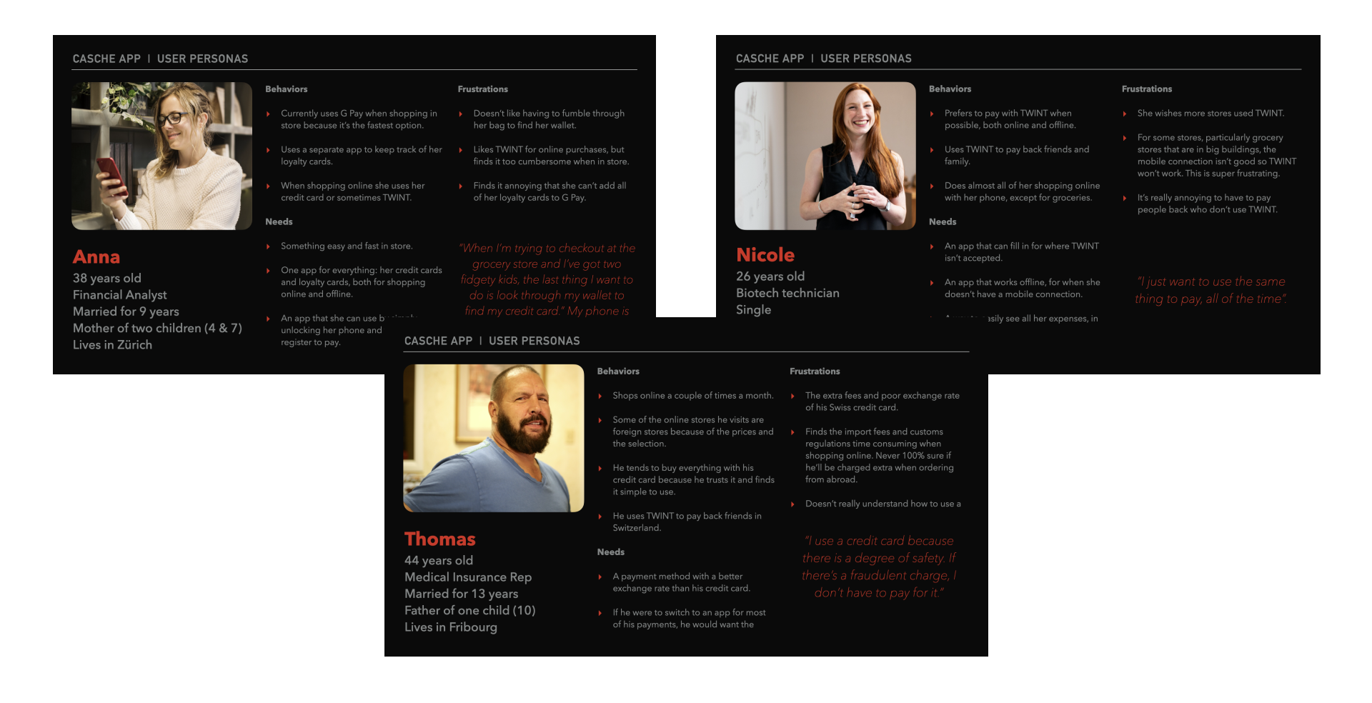
User Personas
Using the findings from the interviews I created three user personas which exemplify the main needs that the CASCHE app should fulfill.
User Journeys
The journeys track two of the personas emotions as they use the app.
Task Analysis and User Flows
04 IDEATE
Card Sort and Analysis
Objective
- Improve preliminary sitemap for CASCHE website’s private pages.
- Gain insights into organization for CASCHE native mobile app.
Strategy
- As there is an overlap in information provided by the responsive website’s private pages and the mobile app, I determined that the best approach would be to focus on these areas rather than the general information pages (i.e. product info, etc.).
- I created 17 cards with OptimalSort and conducted a closed card sort with 7 participants.
- I conducted a closed card sort because I felt that it would be too difficult for participants to distinguish between a public and private website pages.
Key Takeaways
- 14 of the cards had clear associations with categories.
- 3 cards (Help Center, About Us, & Contact Us) were split across 3 different categories.
- The category “Resources” seems to be the most confusing for participants.
Site Map
With the insights gained from the card sort, I modified the initial site map and added a clear separation of public site visitors and logged in users.
Click on sitemap for full size image.
Sketches For Navigation
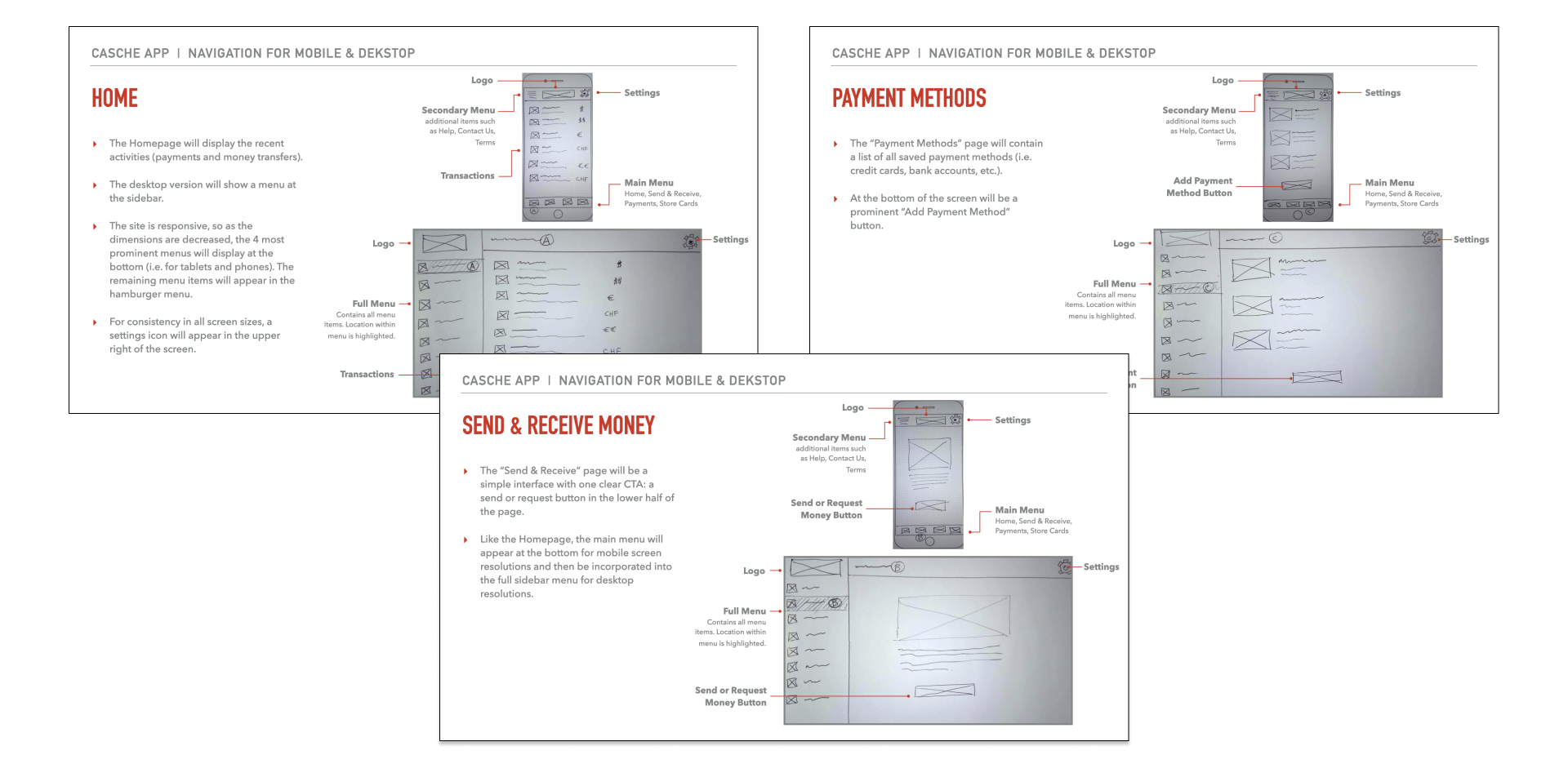
Now that the sitemap was further refined, I sketched out how the navigation would work for CASCHE, as a responsive web app.
05 PROTOTYPING
Low and Mid-Fidelity Prototyping
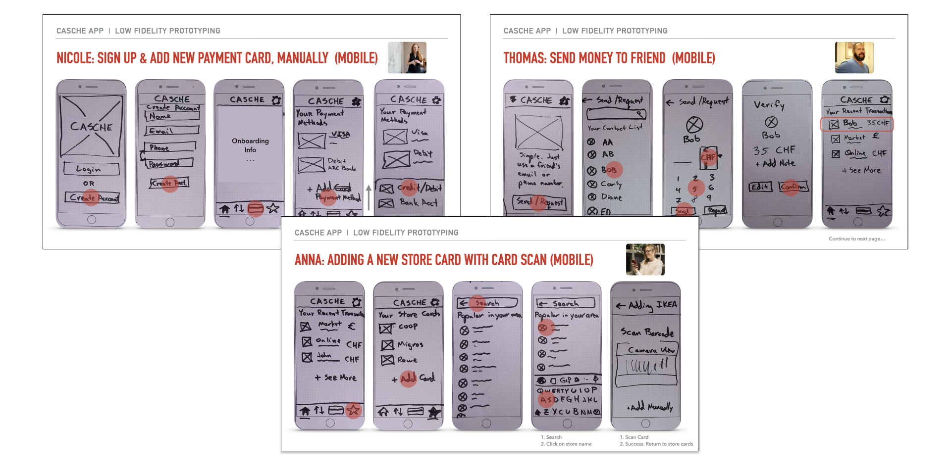
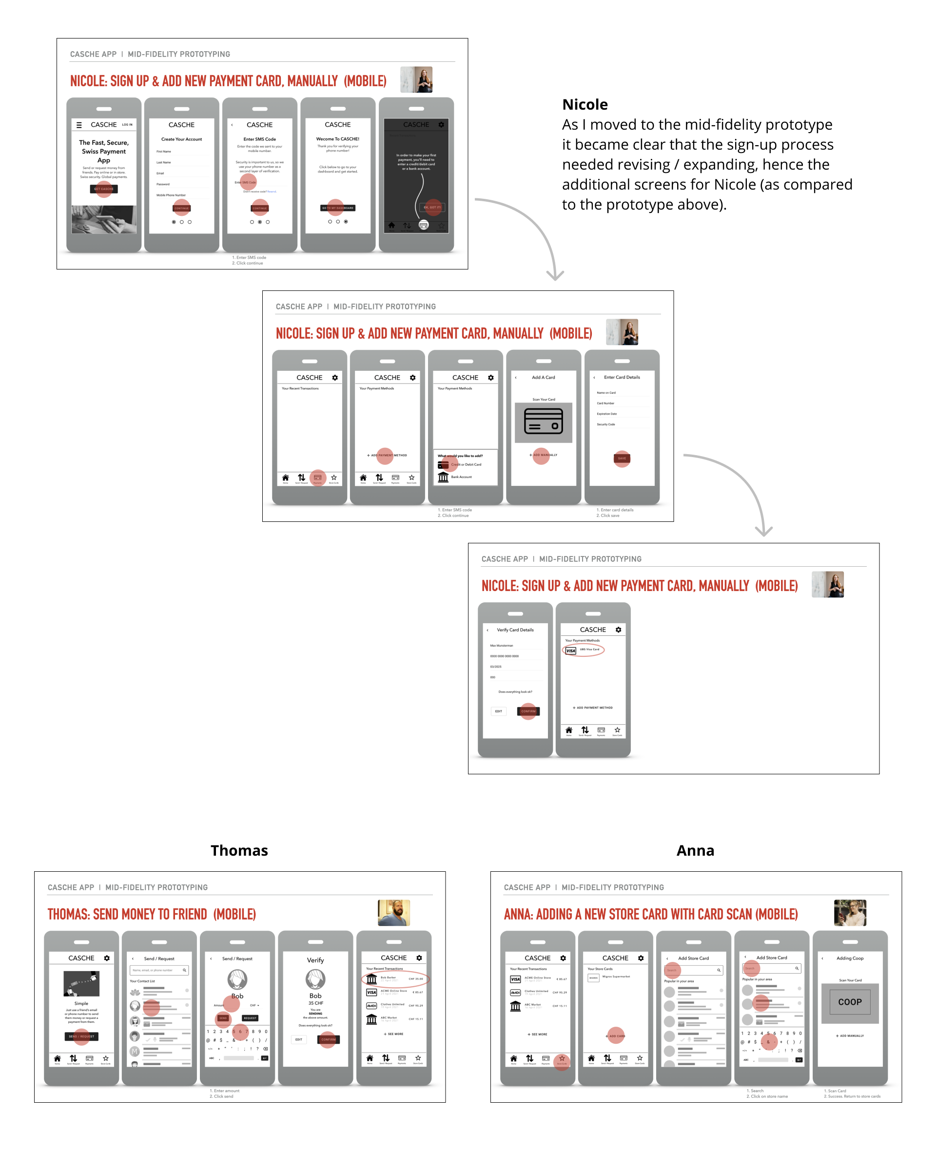
Once I had begun to feel comfortable with the overall navigation and flow of the app, I integrated some of my sketches into low fidelity prototypes showing particular user flows and then later converted these same flows into mid-fidelity prototypes.
06 TESTING
Once I had developed the app into a mid-fidelity prototype, I wanted to get user feedback by conducting usability and preference tests. I made several visual improvements to the prototype to make it feel closer to high-fidelity, but I consciously did not use color in either the text or images, in order to not influence the user opinions.
Usability Testing
I conducted usability tests for the mobile version of the responsive web app, CASCHE with 6 participants. The tests were moderated by myself and conducted remotely.
Tools
- Zoom for meetings, recordings, and screen sharing.
- The prototype was created in Figma and a link was shared with the participants to be viewed in their web browsers.
- Consent forms were PDF format and viewed and signed digitally using PandaDoc.
There were little to no technical issues while conducting the tests.
Key Takeaways
I kept the prototype simple and focused on the main functionality of the app. I was therefore pleased to see that the participants generally found the app easy to use.
There were a couple of areas of improvement:
- The coach marks (at the end of the onboarding process) appear too quickly. Several participants weren’t finished reading before the pop-up appeared.
- For payments: having a verification of some sort, confirming that it was successful would be a welcome feature.
- The homepage (once within the app), should be changed. Having “Recent Transactions” as the main element was confusing.
As part of the process, I reviewed the interview recordings several times to create an affinity map and and rainbow spreadsheet to organized the findings.
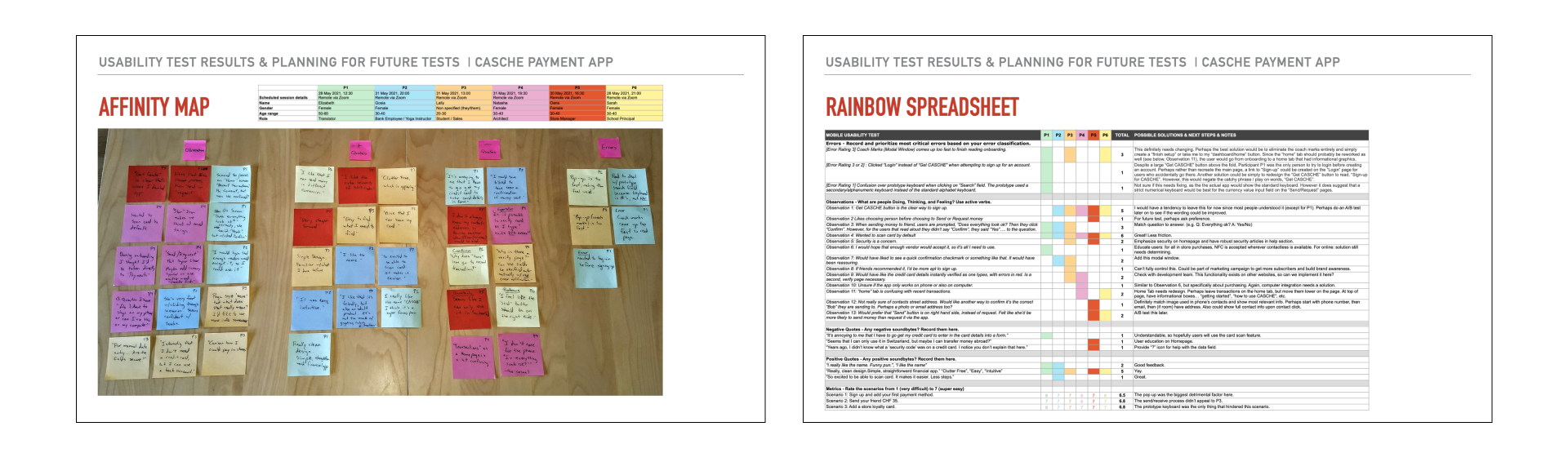
Click on image for PDF file of data.
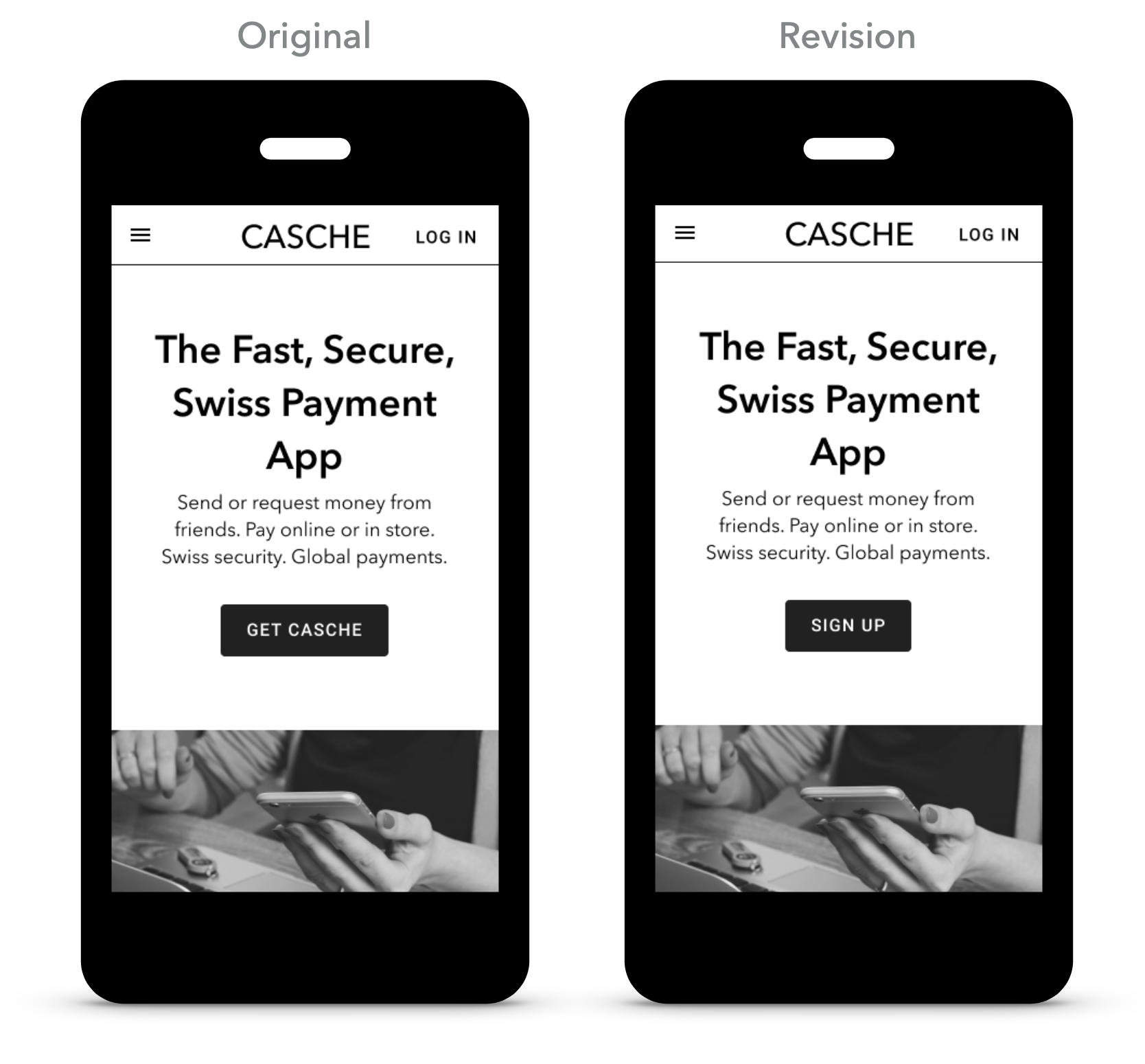
Preference Testing
During usability testing one of the six participants seem to have trouble finding the correct link/button to sign-up for a CASCHE account. Despite this low incidence, it raised the question if the “Get CASCHE” button should be changed.
After discussion with another designer and review of Nielson Norman Group’s article, “ Get Started” Stops Users, I wanted to test if the button could be improved.
As the goal of the button, is to get users to sign-up for an account, I chose “Sign-up” as the new button text.
Test Results
The revised button (i.e. “Sign-up”) was the clear favorite with 82% of respondents (14 of 17 participants) choosing it over the original.
When asked why they chose the revision, some participants said:
“The button clearly states what will come next.”
“‘Sign Up’ is more clear and therefore more accessible to everyone that may use the product”
“More familiar! Not sure what get casche would exactly mean.”
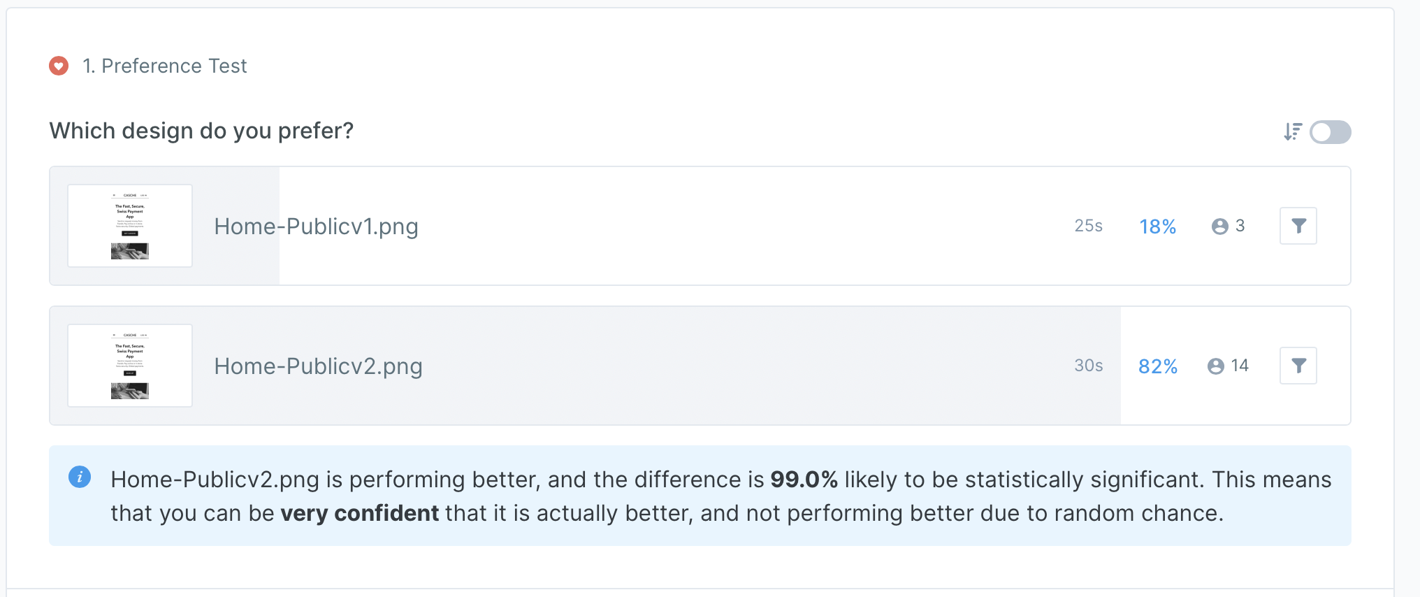
Conclusion
The test results confirmed that the revision is a clearer call to action that the original design, hence the next version of the prototype reflected this change.
07 DESIGN ITERATION
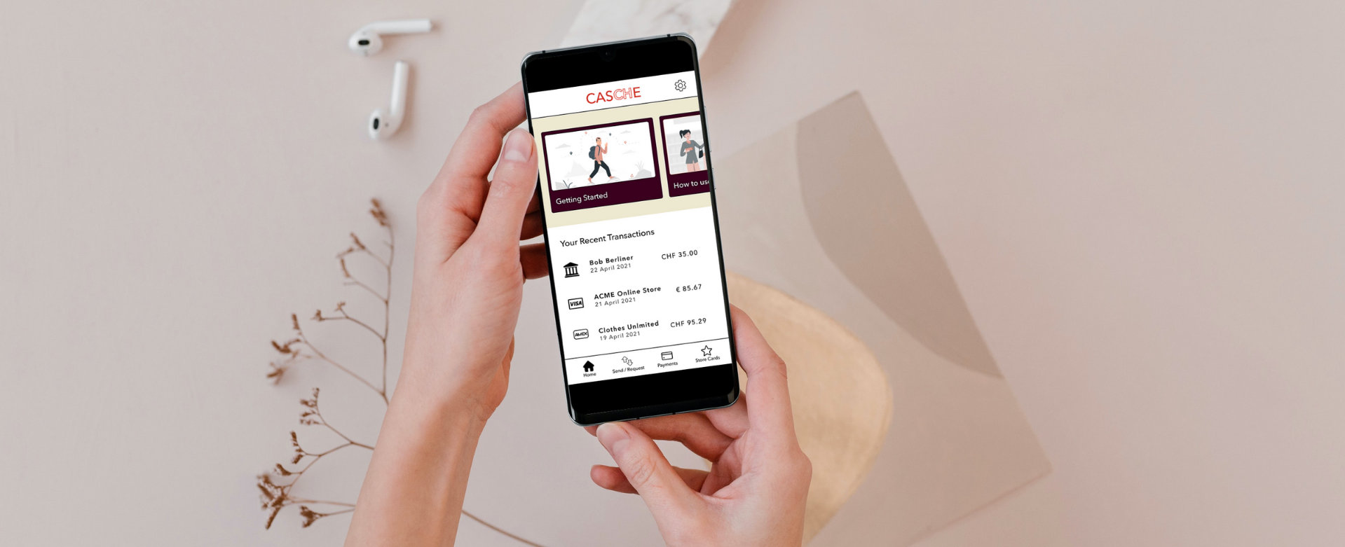
At this stage in the process, I had concrete data to improve the usability of my app. Using this information, combined with creating a design system for CASCHE, I created the high-fidelity prototype that currently exists.
Design Language
Overview
To provide a cohesive user experience across various devices, I’ve created this design language document to act as a central resource for guidelines and standards for the CASCHE app with regards to color palettes, typography, iconography, UI components, etc.
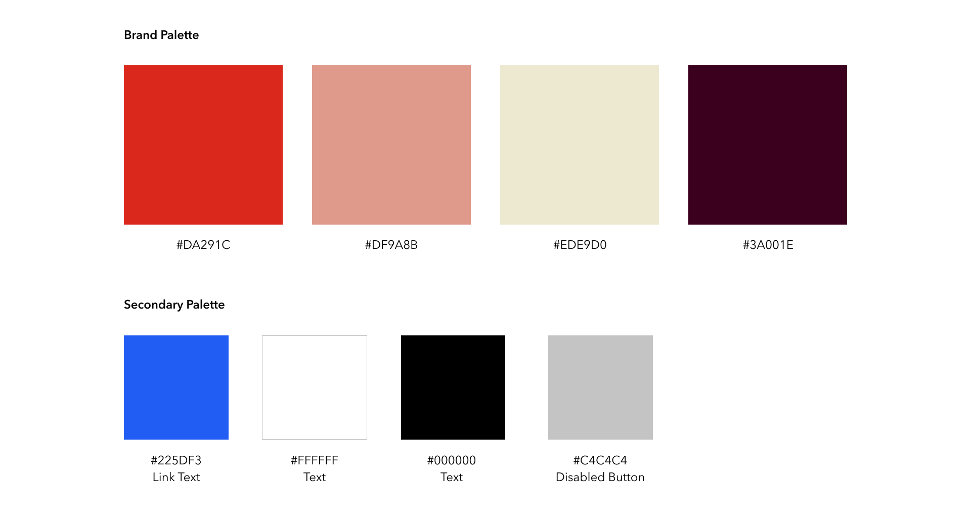
Color
CASCHE’s color palette is based off of the colors of the Swiss flag (i.e. a white cross centered on a field of red). #DA291C matches the official Swiss red. The remaining 3 brand colors act as a complement and convey a simple, refined elegance.
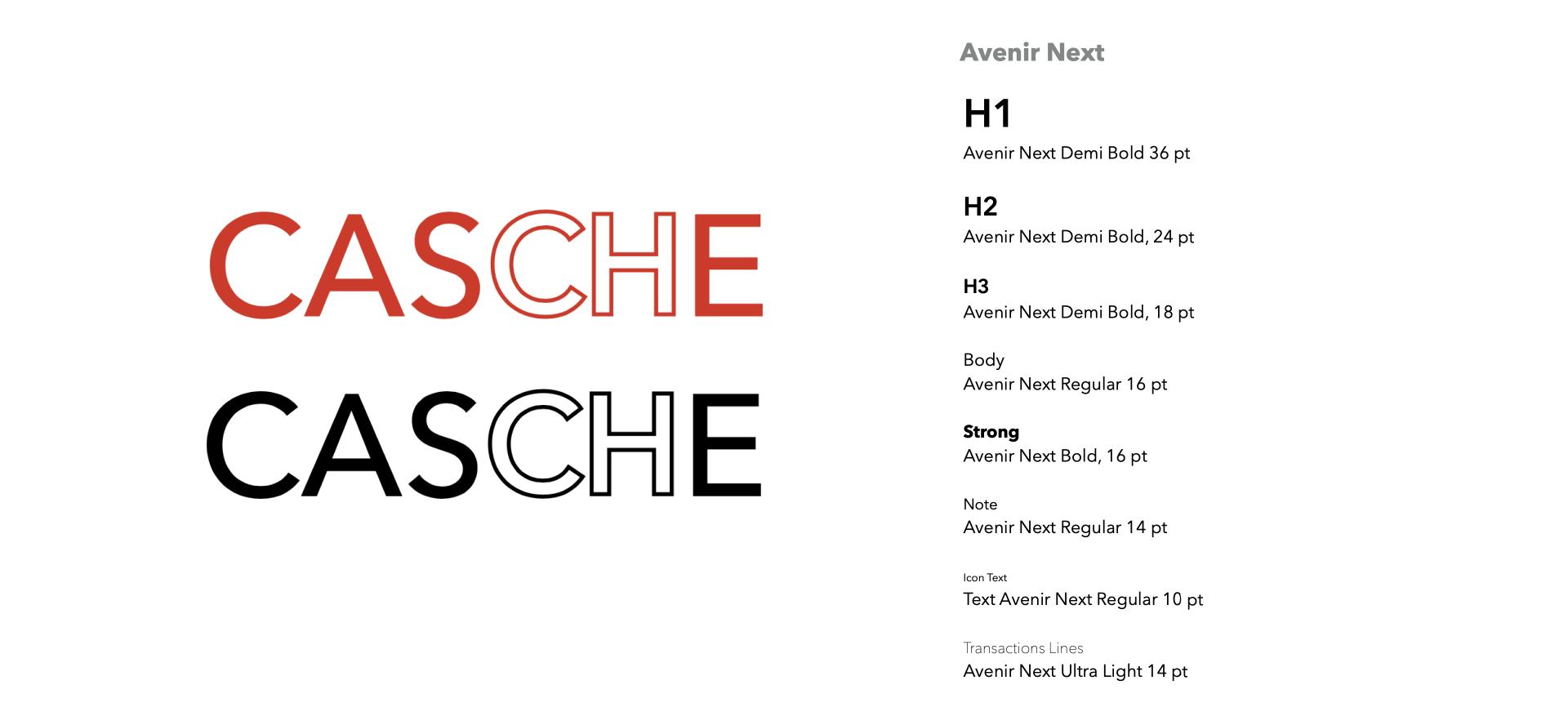
Typography
CASCHE’s typeface is Avenir Next. The logotype also uses Avenir Next.
CASCHE Logotype
Avenir Next Medium in #DA291C, all caps. The “CAS” and “E” are only fi ll. The “CH” is only stroke. When in color, the logotype may only appear on a white background (#FFFFFF). If the logotype is to appear in black and white, the same principles are followed except that red #DA291C is replaced by black (#000000). Examples are as follows:
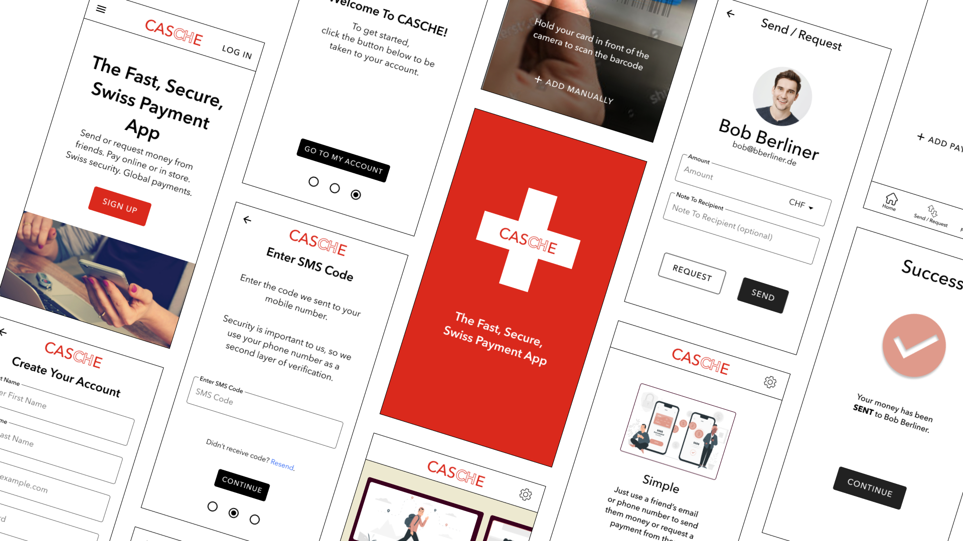
Current Design
The result of all of the research and design steps above is the current version of the CASCHE app prototype. I specifically use the word current, as I would like to further expand on the app’s functionality and do subsequent usability tests.
A few of the areas in which I’d like to continue to research and improve are:
- the multi-currency functionality of sending and requesting payments
- online store payments
- a user flow for adding bank a bank account
Conclusion
The experience of learning about the process of developing a responsive web app has been invaluable. Not only has this project taught me about the steps one takes to reach this point, but it has also made it clear the importance of user centered design thinking.
Key Points
- Initial research is vital to the success of the project.
- Understand the needs of the user and the business before designing. Great ideas are far less effective if designed within a vacuum. Design with the idea that you are solving a user’s problem.
- Get feedback. Seek the input of users, but also other designers.
- Keep it simple and stay focused on the most important solutions. Don’t fall victim to adding too many features, too soon.